

Creating engaging and interactive elements on a webpage can significantly enhance user experience. In this guide, we'll walk through the process of building an interactive SVG eye animation using HTML, CSS, and JavaScript.
Overview
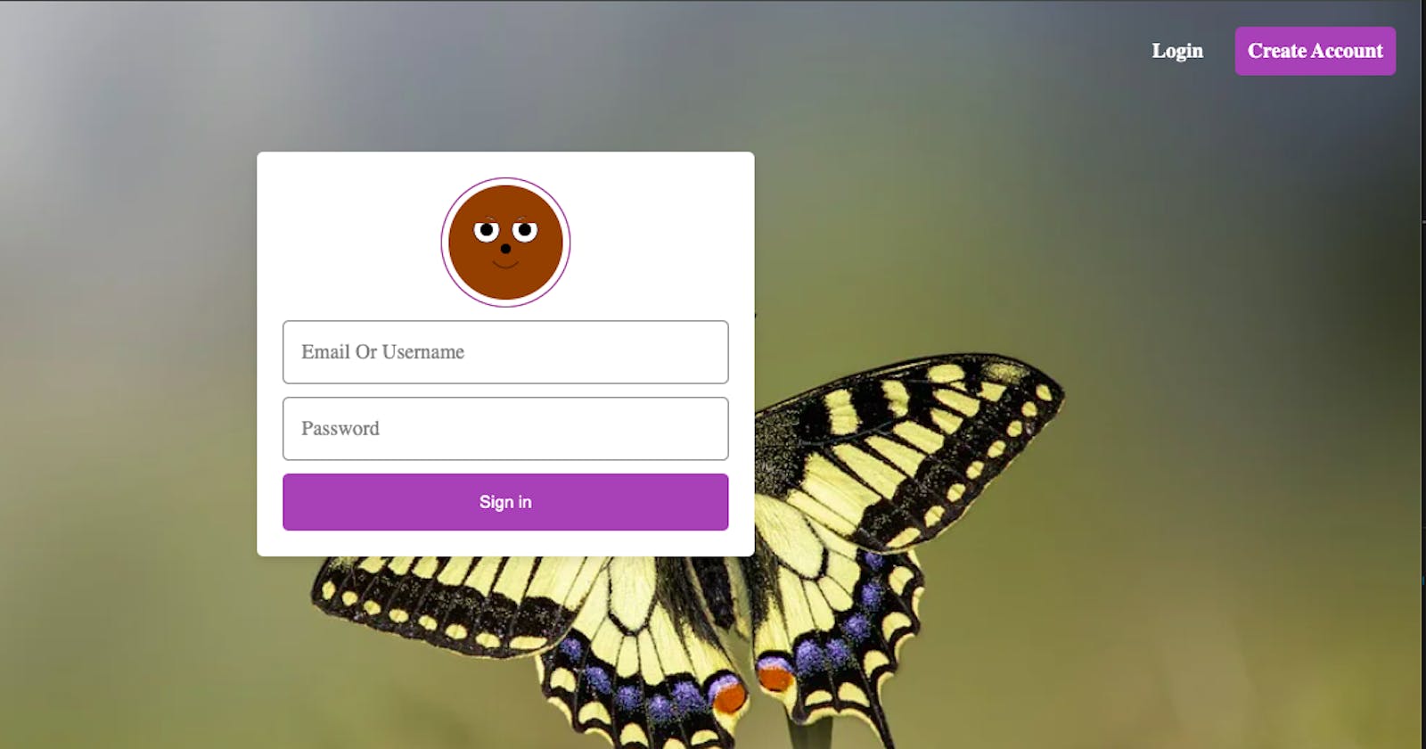
The goal of this tutorial is to create a simple yet engaging animation of an eye that reacts to user interactions, specifically when focusing on a password input field. Let's dive into the code to understand how this is achieved.
The HTML Structure
<!DOCTYPE html>
<html lang="en">

<head>
    <meta charset="UTF-8">
    <meta http-equiv="X-UA-Compatible" content="IE=edge">
    <!-- <meta name="viewport" content="width=device-width, initial-scale=1.0"> -->
    <meta name="viewport" content="width=device-width,initial-scale=1,maximum-scale=1,user-scalable=0">
    <title>Document</title>
      <link rel="stylesheet" type="text/css" href="css/style.css">
    <link rel="stylesheet" href="https://cdnjs.cloudflare.com/ajax/libs/font-awesome/4.7.0/css/font-awesome.min.css">

</head>

<body>

    <header>
        <div>
            <a class="logo">Blend</a>
        </div>
        <div class="righthead">
            <a href="index.html" class="decor">Login</a>
            <a href="register.html" class="decor butt1">Create Account</a>
        </div>
    </header>

    <div class="mygrid">


        <div class="centeredDiv">


<div class="avatar" id="avatar">
    <svg class="bear-face" xmlns="http://www.w3.org/2000/svg" viewBox="0 0 200 200">
        <!-- Bear head -->
        <circle cx="100" cy="100" r="90" fill="#8B4513" />
        <!-- Ears -->
        <circle cx="40" cy="70" r="20" fill="#8B4513" />
        <circle cx="160" cy="70" r="20" fill="#8B4513" />
        <!-- Eyes -->
        <circle cx="70" cy="80" r="20" fill="white" stroke="black" stroke-width="1" />
        <circle cx="130" cy="80" r="20" fill="white" stroke="black" stroke-width="1" />
        <!-- Eye pupils (initial position) -->
        <circle class="pupil" id="leftPupil" cx="70" cy="80" r="10" fill="black" />
        <circle class="pupil" id="rightPupil" cx="130" cy="80" r="10" fill="black" />
        <!-- Nose -->
        <circle cx="100" cy="110" r="8" fill="black" />
        <!-- Mouth -->
        <path d="M 80,130 Q 100,150 120,130" stroke="black" fill="transparent" />
        <!-- Hand covering eyes -->
        <path class="hand" d="M 40,70 Q 50,55 70,60 Q 90,65 100,80 Q 110,65 130,60 Q 150,55 160,70" fill="#8B4513" />
    </svg>
</div>


            <div class='input-container'>
                <input type="text" id="emailOrUsername" placeholder=" ">
                <label for="emailOrUsername" class="placeholder">Email Or Username</label>
            </div>


            <div class='input-container'>
                <input type="password" id="passwordField" placeholder=" ">
                <label for="password" class="placeholder">Password</label>
            </div>


            <button class="buttoner">Sign in</button>


        </div>


    </div>


   <script src="js/script.js" defer>

</script>


</body>

</html>
The HTML structure includes SVG elements for drawing the eye and input fields for email/username and password.
Styling with CSS
  body {
    padding: 0;
    margin: 0;
    box-sizing: border-box;
    background-image: url('../images/raze4.webp');
    background-size: cover;
    background-position: center;
    background-repeat: no-repeat;
    min-height: 100vh;
}

header{
    display: none;
}
.logo{
    font-size: 22px;
    color: white;
    font-weight: 900;
}
.righthead{
    display: flex;
    align-items: center;
    gap: 25px;
    font-weight: 600;
}
.righthead > a{
    color: white;
}

.butt1{
    border: 0px solid red;
    padding: 10px;
    border-radius: 5px;
    background-color: #9b59b6;
    color: white;
}

.mygrid {
    display: flex;
    justify-content: center;
    align-items: center;
    flex-direction: column;
    padding: 40px;

}

.centeredDiv {
    background-color:white;
    width: 100%;
    max-width: 350px;
   padding: 20px;
    height: 100%;
    overflow-y: scroll;
    border-radius: 5px;
    box-shadow: 0 4px 8px rgba(0, 0, 0, 0.1);
    display: flex;
    flex-direction: column;
    gap: 10px;

}


.avatar {
  width: 100px;
  height: 100px;
  border-radius: 50%;
  border: 1px solid purple;
  position: relative;
  display: flex;
  justify-content: space-around;
  align-self: center;
}

.cat-face {
  width: 100%;
  height: 100%;
}


      .pupil {
            transition: transform 0.3s ease, fill 0.3s ease;
        }

        #avatar:focus .pupil {
            transform: translateY(5px);
        }

        #passwordField:focus + #avatar #eyeLid {
            transform: scaleY(0);
        }


.input-container {
  position: relative;
}

.input-container input {
  width: 100%;
  padding: 15px;
  box-sizing: border-box;
  border: 1px solid gray;
  border-radius: 5px;
  background-color: white;
  color: black;
  font-size: 16px; /* Initial font size */
}

.input-container .placeholder {
  position: absolute;
  top: 50%;
  left: 15px;
  transform: translateY(-50%);
  transition: all 0.3s ease;
  pointer-events: none;
  color: gray;
  font-size: 16px; /* Initial font size */
}

.input-container input:focus + .placeholder,
.input-container input:not(:placeholder-shown) + .placeholder {
  top: 10px; /* Adjusted position */
  font-size: 12px; /* Reduced font size */
  color: #9b59b6; /* Adjusted color */
}

input:focus {
  outline: none;

}

.buttoner {
    width: 100%;
    background-color: #9b59b6;
    color: white;
    border: none;
    border-radius: 5px;
    cursor: pointer;
    padding: 15px;
}

/* Media Queries... */

/*Extra Small devices (Potrait phones, 576px and down) */
@media (max-width: 576px) {}

/* Small devices (Landscape phones, 576px and up) */
@media (min-width: 576px) {}

/* Medium devices (tablets, 768px and up) */
@media (min-width: 768px) {}

/* Large devices (desktops, 992px and up) */
@media (min-width: 992px) {
  header{
    display: flex;
    align-items: center;
    justify-content: space-between;
    padding: 20px;
}

}


/* X-Large devices (large desktops, 1200px and up) */
@media (min-width: 1200px) {}

/* XX-Large devices (larger desktops, 1400px and up) */
@media (min-width: 1400px) {}
CSS is used to style the elements, including setting the background, positioning, colors, and transitions for smooth animations.
JavaScript for Interactivity
// JavaScript to handle eye animation
const passwordField = document.getElementById('passwordField');
const leftPupil = document.getElementById('leftPupil');
const rightPupil = document.getElementById('rightPupil');

// Event listener for focus on password field
passwordField.addEventListener('focus', () => {
  leftPupil.setAttribute('fill', 'white');
  rightPupil.setAttribute('fill', 'white');
});

// Event listener for blur (out of focus) on password field
passwordField.addEventListener('blur', () => {
  leftPupil.setAttribute('fill', 'black');
  rightPupil.setAttribute('fill', 'black');
});
JavaScript code listens for the focus event on the password input field. When the field gains focus, it changes the fill color of the pupils to white, giving the effect of the eyes opening. On blur (when the input field loses focus), the pupils return to black, simulating the eyes closing.
Conclusion
Creating interactive SVG animations like this eye animation can significantly enhance user engagement on a website. This tutorial demonstrates the integration of HTML, CSS, and JavaScript to achieve a visually appealing and interactive element.
Feel free to experiment further or apply similar techniques to create various interactive elements on your web projects.